 Nikan
Nikan Statistical Evaluation Metrics
This post consists of:
- ROC-AUC vs F1 and PR-Curve
- PR-Curve
- F1
- AUC-ROC
- Comparison
- Query Outcome Evaluation Metrics Where Order Matters
- P@1, P@10, P@K
- MAP
- MRR
- CG
- DCG
- NDCG
- r-Prec
- bPref
- F-Macro and F-Micro
- The Relation Between Alpha and Beta in F-Measure
- False Negative Rate and Precision
- False Negative Rate
- False Negative Rate-Precision Graph
- Miss and Fallout
- Miss
- Fallout
- Particular Combination of Specificity, Sensitivity, PPV and NPV in Medical Predictor Assessment
- References
1 ROC-AUC vs F1 and PR-Curve
- PR-Curve
- F1
- AUC-ROC
- Comparison
Because all other metrics can be calculated, we first introduce confusion matrix. Our confusion matrix is like this image:
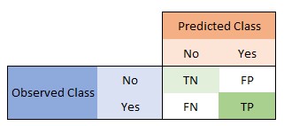
Where: • TN = True Negative • FP = False Positive • FN = False Negative • TP = True Positive
Accuracy is how our model can say class 1 is 1 and 0 is 0 regarding all given examples. Give confusion matrix, Accuracy = (TN+TP) / (TN+FP+FN+TP) So obviously more is better.
Based on confusion matrix, precision = TP / (FP+TP). Precision is the ratio of correctly predicted positive observations to the total predicted positive observations. High precision relates to the low false positive rate. In our case, it says between all those we labeled as positive, how many of the are actually positive.
Based on confusion matrix, recall = TP / (TP+FN). Recall is the ratio of correctly predicted positive observations to the all observations in actual positive class. In our case, between all label is positive, how many we said positive.
1.1 PR-Curve
Precision-Recall curve mostly used for comparing systems at different points.
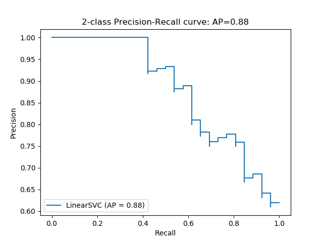
Based on this graph, we can say that a model is better if it has higher precision and recall at same point or any other trade off of these parameters. Best model is the one which it’s PR-Curve intends to stick to top-right corner.
This graph mostly moves downward from top-left to bottom-right which demonstrates the typical decrease in precision due to achieving higher recall. This tendency depicts that if we enforce model to retrieve more relevant items, the more irrelevant items are also retrieved.
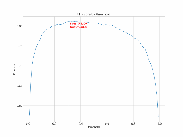
1.2 F1
Based on available values F1 can be defined as follows, F1 = 2*(Recall * Precision) / (Recall + Precision). F1 score is weighted average of precision and recall, so it is very useful when the cost of error of classes are different from each other (say disease detection). Here is a graph to alleviate the comprehension of the problem:
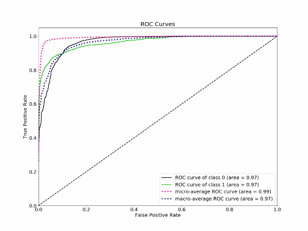
1.3 AUC-ROC
Let’s talk about ROC using AUC value as these are seamlessly interchangeable. This graph may help us to understand it better.
AUC is the area under ROC graph. Higher AUC says our model is more powerful to distinguish between the two classes. AUC = 0.5 says our model almost failed to differentiate. AUC = 1 is perfect model.
For plotting we need two values: 1. TPR = TP / (TP + FN) 2. FPR = FP / (FP + TN)
Now we compare these values regarding different classification thresholds. Increasing threshold would label more entries as positive so it increases both FP and TP. AUC is the aggregated measure of performance among all possible thresholds.
1.4 Comparison
Simply put, F-measure enable us to give importance to recall or precision based on our needs. It is important to remember that F1 score is calculated from Precision and Recall which, in turn, are calculated on the predicted classes (not prediction scores).
Another point that need to be mentioned is that F-measure focuses on positive class which enable us to have a clear understanding of the model’s behavior regarding specific problem as the numbers are easily interpreted.
The challenge in F-measure is to find the best threshold (beta) value to enable approximately best measure over recall and precision. Otherwise the interpretation may be biased toward particular metric. This also is an advantage where we can use it in imbalance datasets to focus on the anomaly (or rare case) rather than averaging over all thresholds which is what ROC does.
It is a chart that visualizes the tradeoff between true positive rate (TPR) and false positive rate (FPR). Basically, for every threshold, we calculate TPR and FPR and plot it on one chart. Of course, the higher TPR and the lower FPR is for each threshold the better and so classifiers that have curves that are more top-left-side are better. The best ROC is the rectangle which has perfect discrimination power for any possible threshold.
One case of imbalance data, ROC is not a good measure as it averages over all thresholds as this will eliminate the effect of anomaly (rare) class. An interpretation for this regarding ROC curve would be false positive rate for highly imbalanced datasets is pulled down due to a large number of true negatives. As ROC is a measure between true negative and true positive, we care about these values more, ROC is a better measure as only focuses on these rates.
2 Query Outcome Evaluation Metrics Where Order Matters
- P@1, P@10, P@K
- MAP
- MRR
- CG
- DCG
- NDCG
- r-Prec
- bPref
2.1 P@1, P@10, P@K
In recommender systems, we only interested in top-K results as almost all results are related buy the user is only interested in few of them. So, we need to assess our prediction using only K top results.
Precision at K is the proportion of relevant results in the top-K set that has rating (by our recommender) higher than a predefined threshold. Simply put, how many of top-K results are really good!
One of the drawbacks of these metrics is that if the number of relevant results is less than K, then the P@K will be less than 1 even though let’s say all outputs are completely relevant and have ratings higher than the desired threshold.
So, in the case of K=1, is the only outcome has higher rating than threshold or not. In case of K=10, how many of outcomes have higher rating than threshold.
2.2 MAP
We know that P@K does not incorporate order of items in outcome lists. Considering these, we can define mean average precision to evaluate whole list to a particular cut-off point K.
The main advantage of this approach is that it enables us weight more loss(error) for top of the list rather than equally treating all items in the list.
To calculate average precision, we incorporate top item then calculate precision, and insert the next item in the list and again calculate precision. We do this to the end of list and take mean over all these precisions. We can compute this for all lists of items (queries) then averaging over all of these average precisions gives us mean average precision.
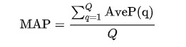
Where Q is the list of queries and AveP(q) is the average precision at point q.
Plotting these precisions at different values of recall gives us an approximation of model’s power. But it is hard to interpret the better model if two model intersect.
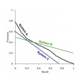
As we can see, A is better than C but we cannot have same argument about A and B. Of the main problems of this approach is that it is averaging over different sublists of lists and also over different query lists. So, noises can dominate and the final result may not be reliable at all. This argument is same we discussed for the advantage of ROC over F1 in imbalanced datasets where F1 averages and obfuscate the imbalance problem! Although this is an advantage than help to discriminate two different model with only a single number!
2.3 MRR
MRR stands for mean reciprocal rank which is defined for a set of different lists of recommendations. Let’s say Q is a set of multiple lists. Then we sort items by their score descending where ranki is the position of the first relevant item in the corresponding list. Averaging over all lists, is the final metric.
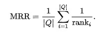
In simple terms, it looks for the answer to the question “where is the first relevant item?”
This method is simple in terms of computation and interpretation and it is in range of 0 and 1 which 1 is best case. This metric only focuses on the first relevant item so as it might be useful in some tasks, it cannot work with tasks than we need a list of recommended items.
Another problem with this method is that in only works in term of binary interpretation of recommended items. For fined ratings, CG has been defined.
2.4 CG
Cumulative gain a really simple measure than only sums fined rating over all items in a list.
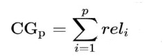
Where p is the position of item in the list and reli is the fined rating of the corresponding item.
This approach is simple and works on non-binary problems but the problem is it does not incorporate the position of items. For instance, a list with 3 recommended items, one at first and the other at the end, will have same score! To solve this issue, DCG has been introduced.
2.5 DCG
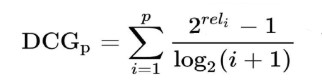
As we said before, just to incorporate the position of items and weigh items based on their positions, a discount factor has been incorporated into the previous formula.
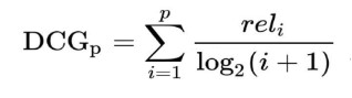
The logarithm of the position increases by increasing the index of position so the rating will be reduced for late items in list. But usually another formula is used to boost the rating exponentially to increase the discrimination power. Here is the actual formula:
2.6 NDCG
The problem with DCG is that the score cannot be used for compare multiple queries. For instance, a query is rare and ambiguous and the another one is not and both have 3 recommended with highest score, but the scores won’t be same as fined rating are not same. To handle this issue, normalization over all queries is needed. A standard factor would be calculating the ideal DCG which means what would the score of DCG in a particular query be if the positions were sorted based on the ratings. IDCG can be annotated in this way:
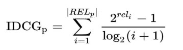
Where RELp is the sorted list of recommended items.
In the end by dividing DCG of each query by its IDCG, we get normalized DCG which can be used for comparing to ranking systems. Here is the formula of NDCG:
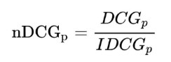
This approach has all benefits of MAP plus it works on fined rating too. Log discounting factor is also very good statistical approach for incorporating positional weighting.
One of the drawbacks is when IDCG=0 which happens when there is no relevant recommendation. Another problem is similar to P@K which in this case, if number of returned recommendations is below p, then the score is not valid and normalized.
2.7 r-Prec
r-Prec or R-Precision is another metric for evaluating frequency of relevant items. Its definition is very similar to Precision@K but there is main difference between these two terms.
Precision at K is the proportion of relevant results in the top-K set is the definition of P@K. Based on, we can define r-Prec in this way: R-precision is the precision at the Rth position in the ranking of results for a query that has R relevant documents. But in R-Precision, R stands for the count of all relevant results in entire result set and we looking for number of relevant items in top-R results.
The power of r-Prec is that it considers a cutoff point regarding a decision based on entire result set, but P@K won’t incorporate any result no matter relevant or not below rank K.
As we said before, the drawback of P@K is the score will be lower than 1 or a small value of the number of relevant items are small in top-K even though that might be all possible relevant results. r-Prec will solve this issue for us as it incorporates the number of all relevant results.
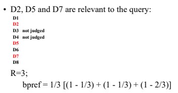
2.8 bPref
bPref is a special metric used when we have an incomplete judgement about the relevant result. For instance, let’s say we have 10 results regarding a particular query, we know 3 of the are relevant, 5 irrelevant and 2 unknowns. Other metrics cannot handle this kind of problem.
bPref computes a preference relation of whether judged relevant items are retrieved ahead of judged irrelevant items. The bPref measure is defined as:
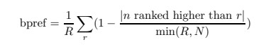
where R is the number of judged relevant documents, N is the number of judged irrelevant documents, r is a relevant retrieved document, and n is a member of the first R irrelevant retrieved documents.
The main advantage of this approach is that it can handle results where judges are incomplete. For a complete judged result, it works very similar to MAP measure.
Here is example to better comprehension:
3 F-Macro and F-Micro
F-Macro and F-micro is defined for the case that we have more than 2 class in our task. In binary classification, f-micro=f-micro=f-measure.
Here is the simple definition for our new metrics:
- Micro: Calculate metrics globally by counting the total true positives, false negatives and false positives.
- Calculate metrics for each label, and find their unweighted mean.
Let’s say we know how to calculate precision and recall and f-measure for a binary confusion matrix. These metrics can be easily computed for any number of classes where the only point is that if computing them for class A, anything other than class A must be summed up and considered as class B, yes, converting to binary class situation.
- Macro: In this case, we need to compute precision, recall, then f-measure for every class. Then to get a final f-measure for entire model, we just need to take an arithmetic average over all f-measures for every class. Note that we can incorporate class frequency to have weighted f-macro too.
- Micro: Same as definition, calculating this metric, needs incorporation of all classes to help us calculate precision-micro and recall-micro first. To calculate precision-micro we need
TP / (TP + FP)which in this case, TP is all correctly labeled samples over all other misclassified samples. In term of confusion matrix, it ismicro-precision = diag / (sum(cm) - diag). Recall-micro can be defined in same way too. So, now we have precision-micro and recall-micro, then computing f-micro is just substituting these values into f-measure formula.
4 The Relation Between Alpha and Beta in F-Measure
To see that this leads to the β2 formulation we can start with the general formula for the weighted harmonic mean of P and R and calculate their partial derivatives with respect to P and R. The source cited uses E (for “effectiveness measure”), which is just 1−F and the explanation is equivalent whether we consider E or F.
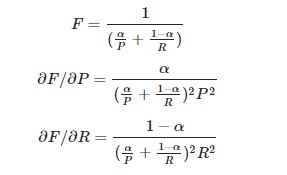
Now, setting the derivatives equal to one another places a restriction on the relationship between α and the ratio P/R. Given that we wish to attach β times as much importance to recall as precision we will consider the ratio R/P:
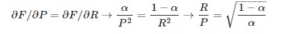
Defining β as this ratio and rearranging for α gives the weightings in terms of β2:
PS: Directly taken from https://stats.stackexchange.com/questions/221997/why-f-beta-score-define-beta-like-that
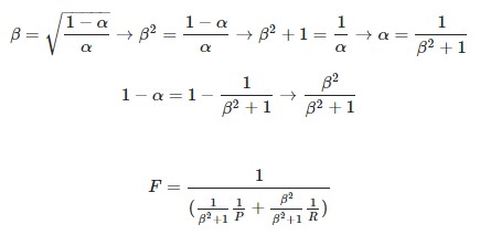
5 False Negative Rate and Precision
1. False Negative Rate
2. False Negative Rate-Precision Graph
5.1 False Negative Rate
False negative rate or miss = FN / (FN + TP). It means we are looking for proportion of cases that have a specific attribute and we missed to recognize that. Mainly, it focuses on amount of error in detecting anomalous behavior. In term of academic expressions, FN means non-rejection of null hypothesis or type II error which can be also defined in alternative way (Type I error) if we negative our hypothesis.
Let’s clarify this using an example. Let’s say we looking for detecting COVID19 using images. FN in our case would be people who has Covid19 but our system has failed to detect them, so it is excessively expensive.
5.2 False Negative Rate - Precision Graph
Based on the hypothesis defined in previous section (COVID19 detection), precision as we defined it before, means how good we detected people with COVID19. So, increasing in TP leads to increasing of precision. But as we increase cases and leads to higher TP, we may miss in detection too, which also increases FN which leads to higher False Negative Error.
Best model will have a graph similar to precision-recall graph but the line has tendency towards left-bottom which means higher precision, lower false negative rate.
6 Miss and Fallout
- Miss
- Fallout
6.1 Miss
Miss Rate and False Negative Rate are identical, so we omit this section.
6.2 Fallout
False Positive rate or Fall-out = FP / (FP + TN). It means we are looking for proportion of cases that does not have the specific attribute but we flagged them as the ones who has. In case of COVID19 hypothesis, fallout means the proportion of people who are not infected but we flagged them as infected. It depends of situation but in this case, the cost of flagging someone positive is much less than letting an infected person just get away! A true example of this is the 3-times experiment of COVID19 even though testing it is expensive.
Furthermore, when we want to decrease FN, we may lead to increase FP as the number of cases increase but cases without that particular attribute are far more populated. Again, in case of COVID19, when we want to reduce the number of failed detections, we have to test more and wider which leads to higher FP.
7 Particular Combination of Specificity, Sensitivity, PPV and NPV in Medical Predictor Assessment
First of all, let’s define specificity and sensitivity using confusion matrix so,
specificity = TN / (TN + FP) | sensitivity = recall = TP / (TP + FN)
In case of medical diagnosing, the sensitivity means how many of people have been diagnosed correctly among all people with the disease. For specificity, we can say that number of people who have not been diagnosed positive (negative test) among all people who do not have the disease.
Some points we should consider is that specificity just will tell us that non-existence of something won’t cause a positive flag.
PPV or precision will tell us how many of people that our model diagnosed that they have the disease, actually have it (PPV = TP / (TP + FP)).
NPV can be defined as precision for negative class which means how many of people that our model diagnosed as healthy are actually healthy (NPV = TN / (TN + FN)).
When number of real positive cases increase, for sure FP and TP will increase but FP has more speed in increasing that’s why PPV will decrease as population grows but only few TP cases have been added. Meanwhile, NPV will increase as TN will increase, we will guess most of the time someone does not have the disease and FP will be small as it only grows with small rate because only a few cases have been added.
The main difference between sensitivity-specificity and PPV-NPV is that sensitivity-specificity will be same for an identical test but if we change the rate of people with diseases, PPV and NPV will change.
8 References
- https://neptune.ai/blog/f1-score-accuracy-roc-auc-pr-auc
- https://medium.com/swlh/rank-aware-recsys-evaluation-metrics-5191bba16832
- https://towardsdatascience.com/multi-class-metrics-made-simple-part-ii-the-f1-score-ebe8b2c2ca1
- https://medium.com/@m_n_malaeb/recall-and-precision-at-k-for-recommender-systems-618483226c54
- https://en.wikipedia.org/wiki/Evaluation_measures_(information_retrieval)
- https://cs.stackexchange.com/questions/67736/what-is-the-difference-between-r-precision-and-precision-at-k
- http://people.cs.georgetown.edu/~nazli/classes/ir-Slides/Evaluation-12.pdf
- https://trec.nist.gov/pubs/trec16/appendices/measures.pdf
- https://www.mdedge.com/familymedicine/article/65505/practice-management/remembering-meanings-sensitivity-specificity-and
- https://geekymedics.com/sensitivity-specificity-ppv-and-npv/
- https://towardsdatascience.com/false-positive-and-false-negative-b29df2c60aca
 Phase Amplitude Combination, Hybrid Images and Cutoff Effect On It